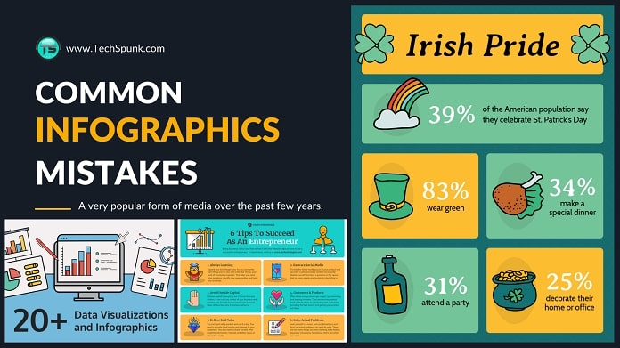
Infographics are a popular way to present data and information. You can use them in reports, presentations, blogs, and more.
The goal of an infographic is to help the viewer understand information by providing it as a visual representation. Choose the best infographic templates for your professional use.
However, many mistakes can be made when creating infographics, which will lead to poor presentation quality or, even worse — no one looking at your infographic!
If you do professional writing and you want to know what is happening to your common writing mistake, then you can improve your common mistake by reading our article.
Table of Contents
10 Mistakes That Will Kill Your Infographics in 2023

Here are ten ways you could be killing your own work before people even get a chance to see it.
1. Poor Organization.
 The organization is key in an infographic. You want to make sure that you make it easy for your viewers to see your information and understand what the infographic is trying to convey.
A lot of thought should go into how exactly you plan to put the info together and where you will place it on the page (and why).
If you do not organize your material correctly, it will be challenging for the viewer to see what you are trying to say.
2. Lack of Data or Content.
 This is a biggie that people don’t seem to think about much.
You want to make sure that you have enough content and data to fill up your space.
If your infographic is too small, it will appear to be a waste of time and information.
On the flip side, if your infographic is too big, the viewer might not see all of what you have put together.
3. Too many different fonts!
 This is an important one for both editors and readers. Different fonts can become very distracting when trying to convey a message.
If you have too many different fonts, it will be difficult for the reader to stay interested in what you have to say.
All infographics should stick with 1 to 2 fonts that match each other and look professional.
4. Not enough colour variation or contrast.
 There should always be a reason for adding colour to an infographic.
Make sure that you vary the colours throughout your infographic and also use colours with high contrast to each other.
Avoid using too many of one colour as it will make the infographic look flat and dull (unless that is your goal).
5. Too much text!
 No one wants to read a massive wall of text. Well, an infographic should never be a wall of text.
Everything in your infographic should add something to the whole piece.
You want to ensure that you have enough images and different fonts going on so the reader will not get bored reading all of your information.
6. The design is too distracting.
 This is the exact opposite of what I mentioned above.
You want to ensure that your infographic design doesn’t detract from your data and information.
One good way to check if you need to change the design is to squint at your infographic until it becomes blurry.
If all of the crucial bits become clear, then you are good. If you can’t make out what is going on, the design needs work.
7. Not enough contrast from background to infographic colour.
 This is another thing that should be checked while looking blurry-eyed at your infographic.
You want to make sure that there is a good balance between your primary infographic colour and its background.
Sometimes, just changing the background colour is enough to make your infographic more readable.
8. Not using any relevant images.
 Make sure that there is a purpose for every image you add and that it adds to the overall piece.
This might seem obvious, but you would be surprised how many people forget to add relevant images to their infographics.
This will distract from the information you are trying to convey and leave your infographic looking amateurish.
9. All of your links go nowhere or don’t work.
 This is also an easy one to overlook. You should always check all of your links before publishing.
Make sure they take the viewer to where you want them to go.
If you see any mistakes, then publish your infographic only after solving them.
Do not try to ignore such mistakes.
10. Just not very interesting!
 This is probably the most common mistake with infographics; they aren’t fascinating and engaging.
You need to make sure that you give your cool infographic a unique angle and make it as relevant as possible for people to be interested in viewing it.
If people are interested, you will reflect on your infographic’s number of views.
Our Thoughts
The best infographics have become a prevalent form of media over the past few years. They are engaging and can easily convey a lot of information in one cohesive piece.
However, infographics have more than just slapping your data together and adding fancy fonts and images.
Making sure an infographic runs smoothly and looks good is no easy task, so it is essential to evaluate your work and that of others.
Making sure all the details are in check might not seem like a big thing, but these small things can make or break an infographic.
So, keep this post in mind next time you create one and try your best to follow all of these tips. If you’re having a hard time making one your own, use infographics.


